Case Study: Unintended ambiguity in UX Design
CONTENT
Exploration
User Observations
Hypothesis
User Analysis
Ideation
Conclusion

CVS Specialty is CVS’ customer pharmacy mobile app solely for the purpose of ordering, status checking, and renewing SPECIALTY drugs.
While reviewing this app I noted a few distracting/ ambiguous elements as part of the app’s opening frame.
In this Case Study I added my insight as to what would make a seamless and user-friendly experience,
Added flat 2.0 design principles
Redesigned a sign-in button that gave users the impression that it was a toggle slider.
However, this seemingly simple approach led to unexpected challenges, uncovering the importance of careful consideration in UX design.
The snag:
The first issue taken the start button's appearance. It’s ambiguous.
Users, when presented with this button, tried to slide it with their thumb from left to right. But this is a conventional login-button.
They were perplexed by the toggle/slider not sliding.
Users thought the app was frozen.
The snag: part deux
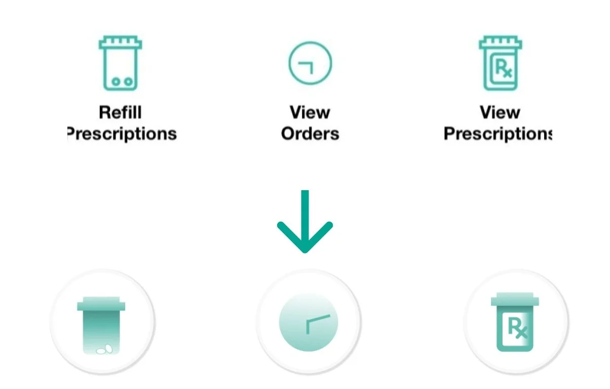
It was noted that users did not tap the pill bottle, the clock, and the RX bottle. Users instead tapped on the text underneath. This indicated that the graphic elements were probably too Flat .
Button ambiguity | Flat Design:
While flat design is supposed to simplify visual elements, it accidentally contributed to some confusion.
The absence of traditional button affordances, like shadows or depth, gave users no usual visual cues to rely on for identify interactive elements.
The users thought they were just decorative images because the flat design icons didn’t look like buttons.
Toggling Tension:
The choice of a toggle slider for the start button, while visually distinctive, was a usability challenge.
Users were unsure about the state of the app.
“>” Is the only indicator to tap and it’s not enough for users.
The Right pointing arrow is a ghost button. It is not obvious enough for users.
User Feedback:
Upon user testing and feedback, it became evident that the initial design choice, while cool and minimal looking, compromised the app's ease of use. Users didn’t even know that those icons were buttons, and the sign-in button didn’t look like what was expected. It created a disconnect between their mental model and the app's actual functions.
Resolution:
Recognizing the consequences of CVS Specialty’s design choices, I went and created a start/ sign-in button implementing Flat 2.0. Iterative testing with alternative designs afterwards, including incorporating subtle shadows and a clearer button that is intended to look un-pressed so that the user will be invited to start there.
Re-design answer: one big button
By refining the start sign-in button's design and keeping the flat design aesthetic by making the icon flat 2.0, The revised interface not only clarified the app's status but also preserved the aesthetic appeal.
Re-design answer: shady round buttons
By giving the button's a shaded circle and keeping the flat design aesthetic with flat 2.0, The revised buttons not only clarified that the elements were clickable but also preserved the aesthetic appeal.


