GARMIN:
inReach Mini 2
A case study in proving accessibility issue for low vision Garmin users
My Roles:
PROTOTYPE
EMPATHY MAPPING
VISUAL DESIGN
RESEARCH

Design Process + Contents

Product Background
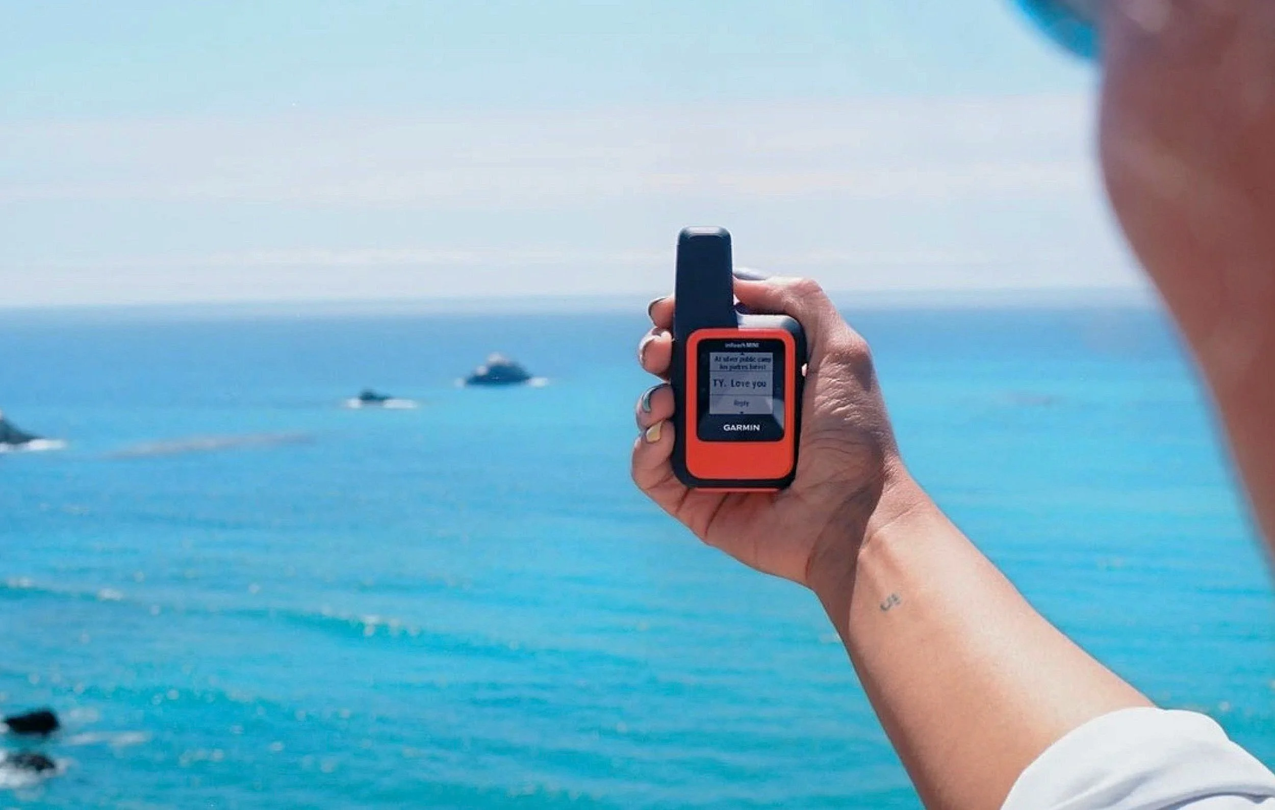
The Garmin InReach Mini 2:
Is an S.O.S. and satellite communication device.
It sports a 176 x 176 pixel screen.
Is this device accessible to users with low vision?
Adventurers of all abilities are in the market for a compact life saving device
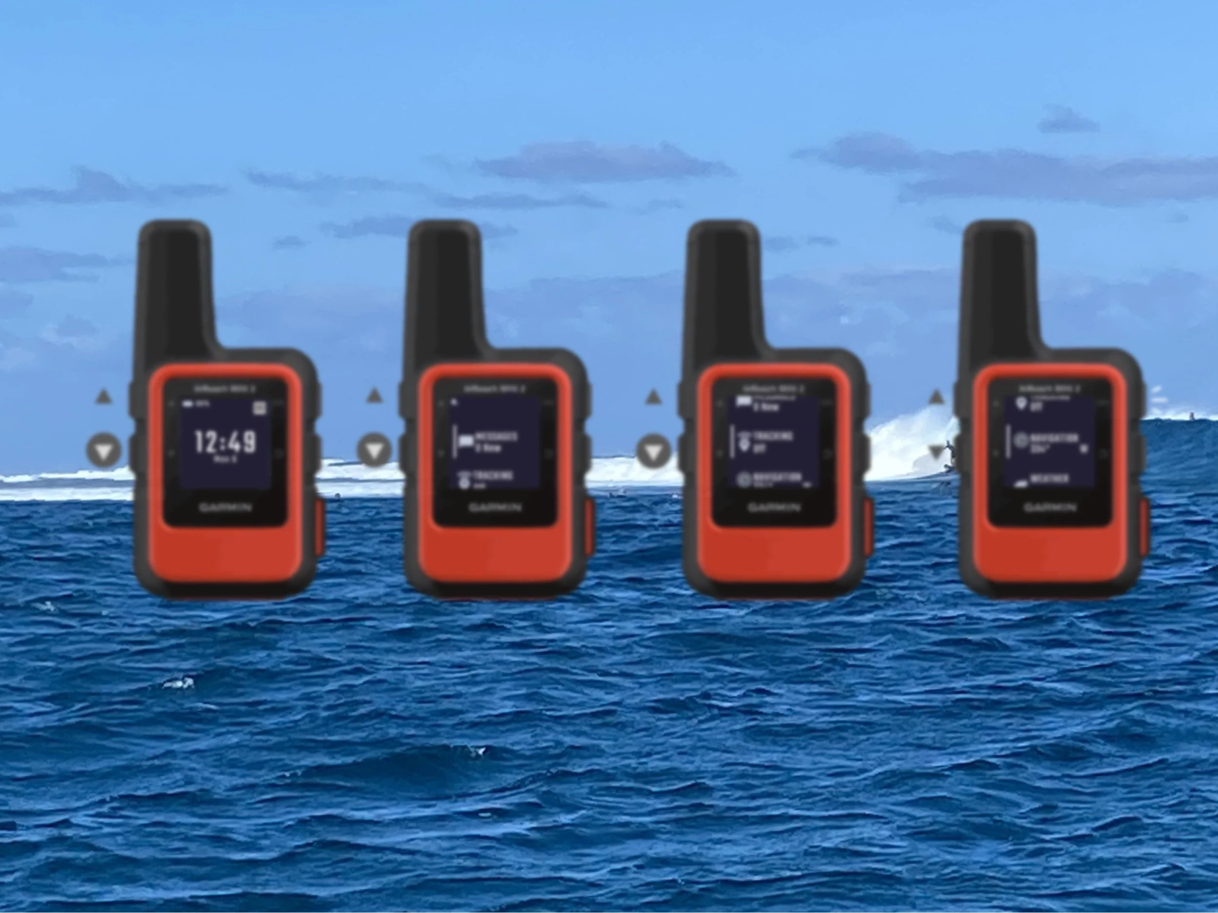
Design goals: Produce a high fidelity prototype that shows a display screen that my participants can see through the visual impairment simulator.

Empathizing through user stories humanizes the design process, giving a deep understanding of users' needs, goals, and challenges.
it enables the creation of more user-centric solutions, ensuring that the final design resonates with and effectively serves the intended audience.
USER STORIES
As Lars, I want to be able to know that my Garmin will actually save me, what if I hurt my eyes?.
I’m Max, as a visually impaired adventurer I hope that in the time of an emergency, I’ll be able to see the options on my Garmin screen.
When I- Mel, am feeling like I’m lost and am almost considering calling for help I don’t want to be fumbling and having trouble making a selection.

Persona Profiles
Two user profiles were made to better understand the needs and goals of Garmin users. They do activities that can be benefitted by using an S.O.S. communication device.

Empathy mapping
Through empathy mapping I can design toward specific users - I keeping them in mind I always have something to reference.
I chose personas that are not alike as it challenged me as a designer to have a broader view on the users.
RESEARCH DETAILS:
Constraints
Not having the population of visually impaired users to test on in person.
Solutions
Using a tool to work within the constraints
Through a simulator, Garmin’s interface can be viewed through the eyes of anyone with common vision disorders.
ViaOpta is an augmented reality application that allows users to quickly select an ophthalmic disease and immediately visualize it on-screen.
ViaOpta
Hypothesized solution
A higher contrast display for the selected option to be visually accessible
ADA guidelines typically recommend a minimum color contrast ratio between text and its background to ensure readability. This ratio is measured based on luminance values.
PROBLEM:
After consulting Norman Neilson’s 10 usability heuristics for UI, the most obvious accessibility problem discovered is #5 (Error prevention): By being not visually accessible, the error not being prevented is causing the user to lose time to call for help.
How can the device save someone if they cant see what they’re selecting?
A selected option is shown as a thin line of pixels on the screen’s left. This is the only indication that an option is ready to be selected.
At this stage in the design process:
I produced visuals towards what could solve the problem.
I used the app Procreate to draw out the basic hypothesized vision.
Procreate allows me to easily send these drawing files off for client feedback and developer reviews before committing serious head-down time creating the prototype.
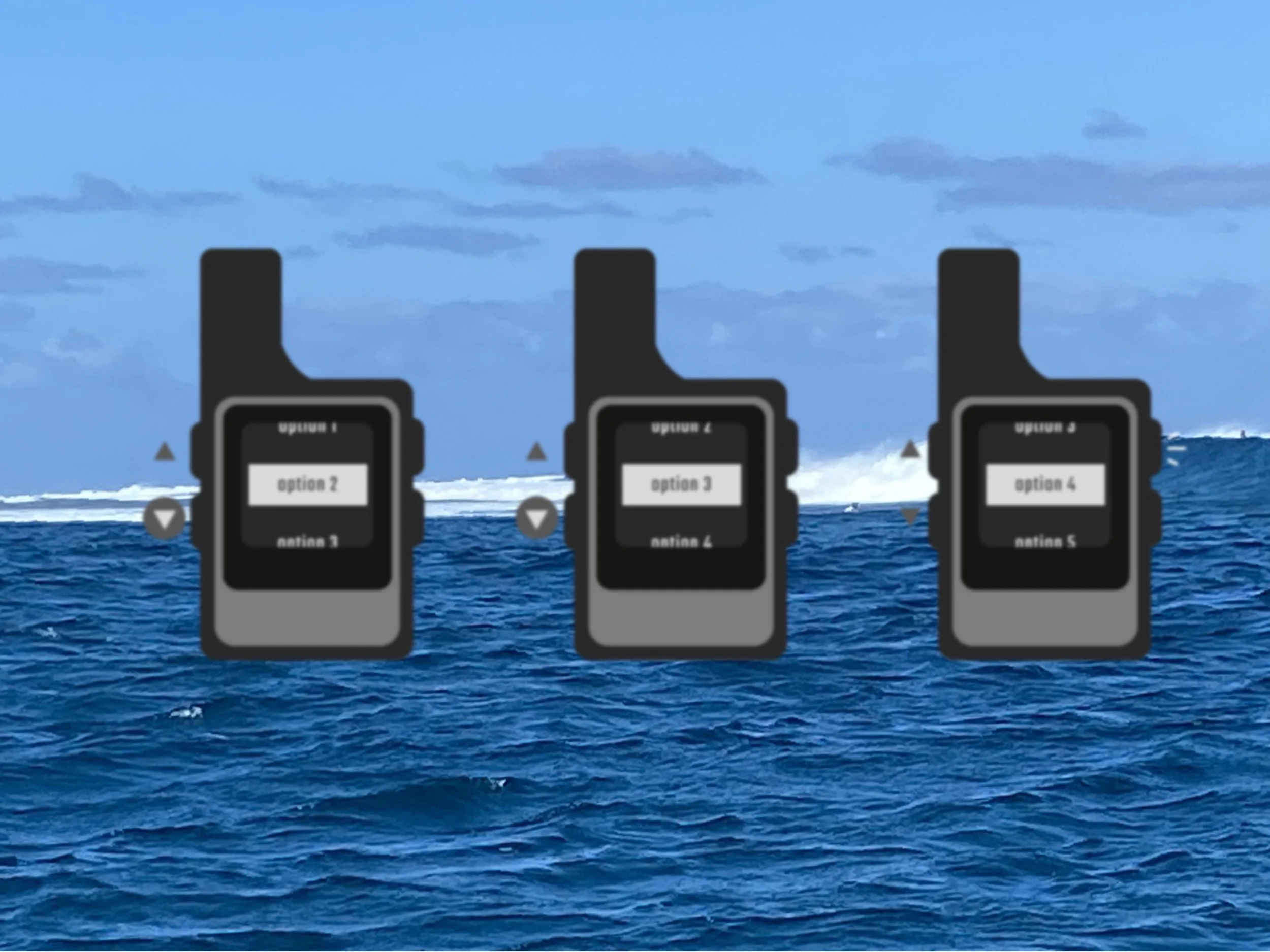
Selected option becomes highlighted
Negative highlight if in daylight mode
After the Procreate drawing gets an OK, in Figma I created the same idea for the low fidelity prototype: a higher contrast on the selected option.
Low Fidelity Designs:
Into the simulator
ViaOpta By NOVARTIS
The research participants available for user testing had healthy vision
By using the simulator, I could test users with typical vison and they can give me similar results of users with impaired vision.
To test the device’s accessibility, the participants will questioned on the device while viewing the screen through the ViaOpta simulator.
A very common low vision disorder is Presbyopia: It makes close up objects appear blurry related to aging, where the intraocular lens inside the eye becomes stiffer with age, not allowing the eye to focus.
User Tests
The images used to question participants have been passed through the user simulator to replicate vision impairment.
User survey parameters
1-5 scale: Visibility measured on a scale of 1 - 5
“Can you discern if an option is selected?”
22 Participants

Survey 1: ORIGINAL Device
“which of the following responses would best describe how well you can see the option on the screen. “
40% of the 22 participants selected 2 on the scale:
“I can only see some parts of the screen.“
This indicated that low vision users could see which option was being highlighted 0% of the time.
Survey 2: LOW FIDELITY SURVEY
Out of 22 participants
0% chose 1
9.1% chose 2
9.1% chose 3
9.1% chose 4
72.7% chose 5
Survey findings
Designing the lo-fi prototype according to the hypothesis, it was evident that the proposed solution was effective.
Highlighting the selected option on screen had 72% of the participants choosing 5 on the scale.
16 out of 22 could discern that an option was being selected.

Utilizing Figma, I compiled the survey data collected and layed out what was changed in this graphic.
Here are the steps taken from the Original Device -> Low Fidelity Iteration -> Hi Fi Iteration

These Hi-Fi visuals were created and tested on once more.
Survey for Hi-Fi
Image below is the hi-fid prototype seen through OptaVia’s visual impairment simulator.
Conclusion
The surveys proved that this was a real UI problem for the visually impaired.
The current UI was causing errors for visibly impaired users. It didn’t adhere Neilson Norman’s Heuristic rule #5 of preventing errors. This caused many users to be unable to see if an option was selected.
The heuristics and ADA color contrasts can be followed by implementing a highlighted option would be easier for users of low vision to see.
What I would do differently next go around:
I would have a pool of visually impaired participants to test on further.
sourcing visibly impaired users to keep project in scope
In field observational testing
Testing in different lighting
Trial an interactive wireframes of the high fidelity prototype


