Site Audit of the industry's first no-code manufacturing automation platform
Vitesse is the automation industry’s first software to enable factory workers reprocess/ change the automation process without coding. Users of their software called Designer can seamlessly connect any factory automation equipment (most notably the 6-axis arm) on the market.
Tools:
Figma, Adobe Illustrator,
Methods:
Competitive Audit,
Information Architecture,
Ideating
Problem summary:
The design of this website doesn't seem to align with being part of the industry's leading no-code automation platform.
The homepage falls short aesthetically and could use some improvement. In design terms; it's not looking great and lacks visual appeal.
designed to be part of a fast growing world of automated software. The software to make these machine changes are able to be made by workers with no code.
Do potential clients know what they are looking at?
Clients searching for software to speed up their factory automation process need to know that Vitesse Automation is the best provider possible.
Current user journey map:
Providing clarity
Make sure that VA’s intention in the hero section is immediately clear as to what they can provide the potential client
The problem revolved around the communication from the headline and how it guided the readers' eyes on a journey down the page.

Info architecture.
The website's conversion funnel focuses on guiding page visitors towards becoming buyers.
This is achieved by prominently featuring a demo and products page in the hero section.
Additionally, the site strategically raises awareness about the product immediately after the hero section.
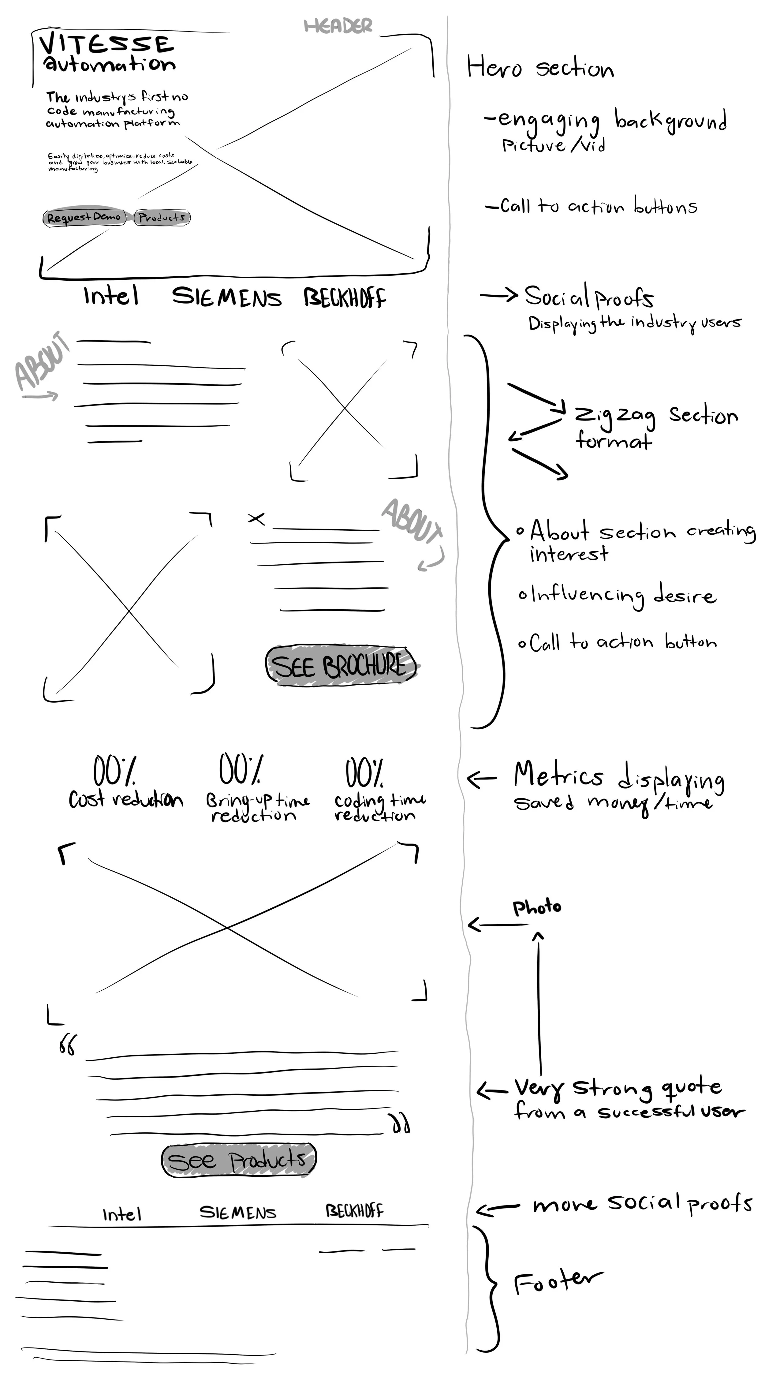
Idea developed in Procreate
Ideating a clear visual layout for the site visitor’s eyes to follow down the page and be drawn into CTA buttons.
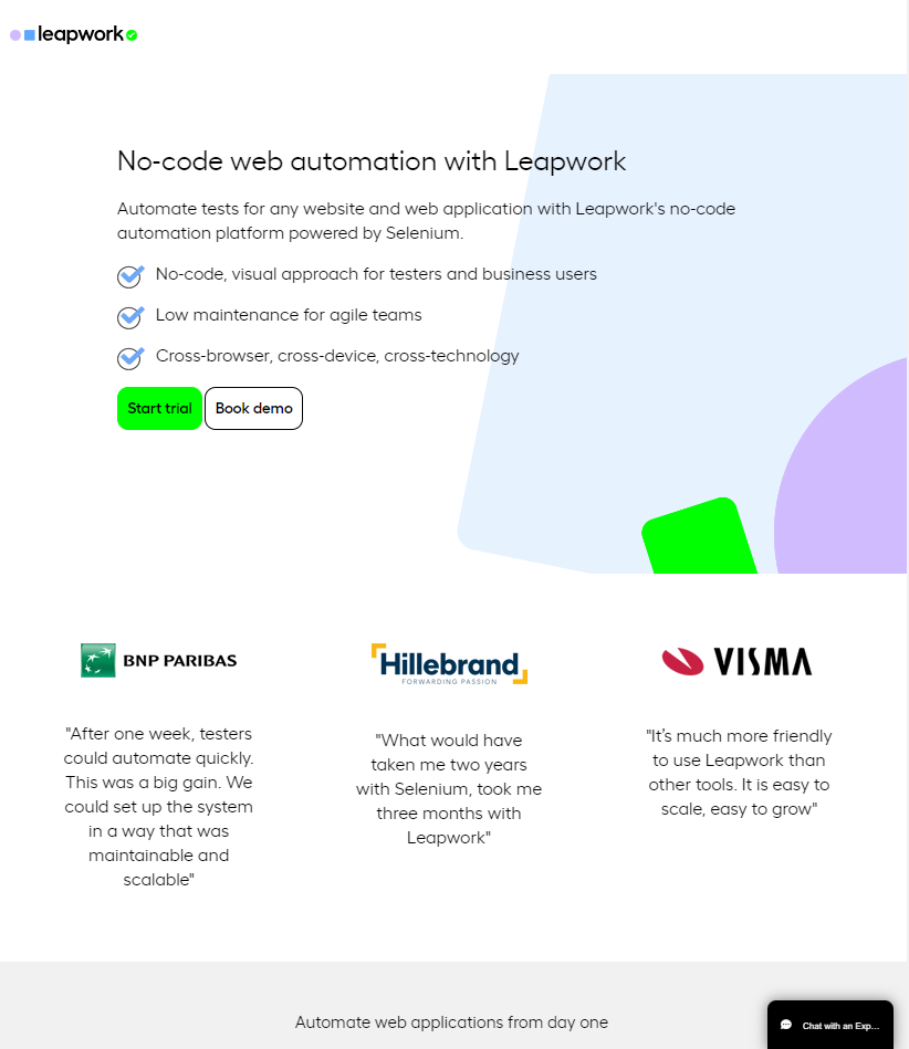
Competitive Audit
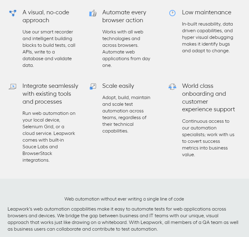
Clear explanation with benefits outlined.
Offer of a trial and demo CTA right away.
Social proofs from industry users with quoted experience.
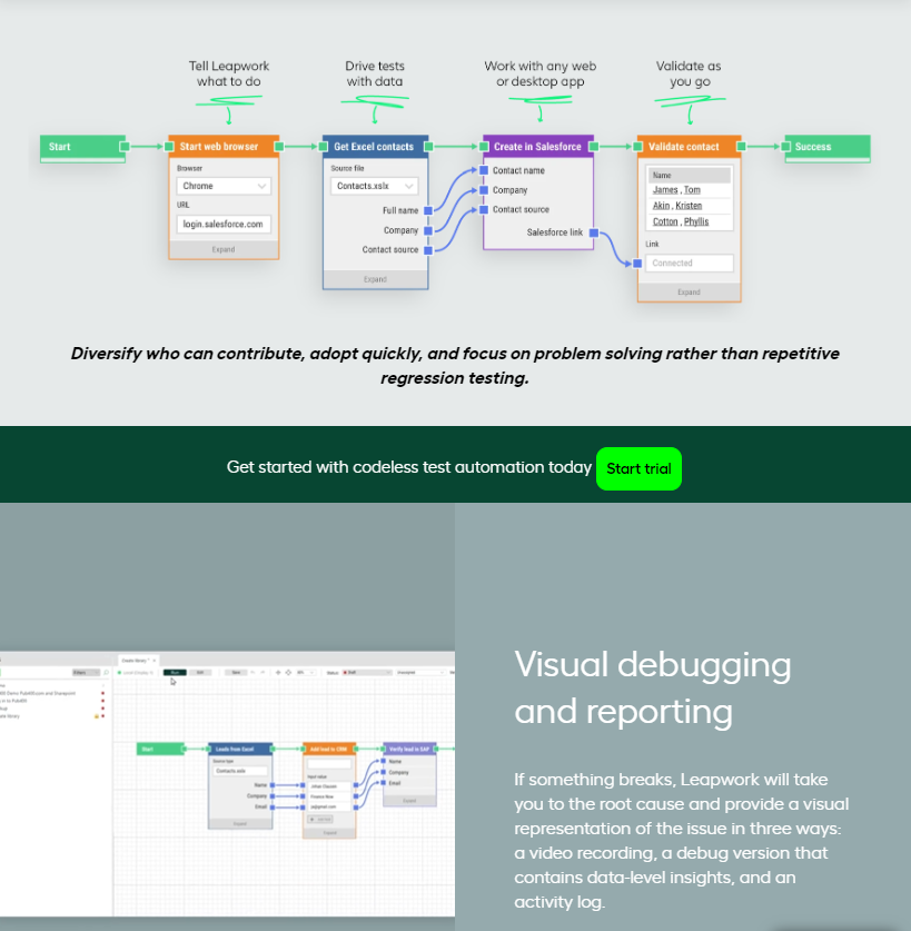
Informative “how it works“ section, denoting that goals can be achieved from day one of program use.
Informative “how it works“ section VISUALIZED.
simple digital wireframes.
An ideation
HOME page
PRODUCTS page
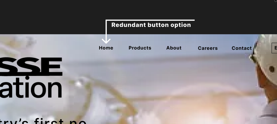
Redundant ‘HOME’ button
WHAT WENT ON
A strong home page and hero section is crucial for several reasons:
Clear Communication:
The hero section is the first thing visitors see. It's an opportunity to make a positive and memorable first impression, setting the tone for the entire user experience.
Clear and concise communication here ensures that visitors quickly understand what the product or service is about.
Engagement and Interest: A well-crafted hero section encourages visitors to engage further with the website.
User Guidance: Including a call to action directs visitors on the next steps to take. particularly the Demo or Trial options, a clear CTA guides user interaction.
Visual Appeal: Strong visuals in the hero section capture attention. High-quality images that resonate with the brand speaks to the visitor visually.


